iPad Tweet Density Visualization
For my Visualization and Insight on the iPad class in Spring 2012 at Carnegie Mellon University, students were tasked with creating an interactive visualization of geotagged Twitter data. I was intrigued by looking first at the relative tweet density across geographic regions—on a normalized scale, was New York City tweeting more than Austin, for instance?
After gathering the requisite data to make such calculations, the project expanded into a more general visualization of geotagged tweets with user-activated filtering by race, income, and education levels.
Duration: Two weeks
Skills used: prototyping, Python, Objective-C
Download: (The Xcode project is available upon request.)
Background and data
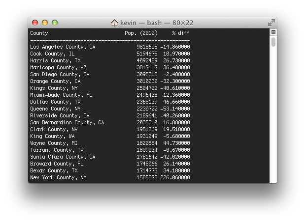
Users have the option of enabling a geotag when sending a tweet. Although relatively few tweets are geotagged, there is still sufficient data to cull a decently-sized dataset. Using such a set of about 100,000 geotagged tweets from the continental United States, I queried a web service to collect county information for each tweet. Altogether, the tweets came from 1927 different counties—only about two-thirds of the American counties, but those 1927 counties represent about 95% of the American population.
To normalize the data, I began by naïvely looking at the proportion of overall tweets a given county represented as compared to its proportion of the continental United States' population, and represented this difference as a percentage. Although this method showed some interesting trends—for instance, counties in the primary city of an urban area were tweeting more than they should be, and counties in the suburbs were tweeting less, suggesting that commuters were responsible for many tweets—this method did not account for outliers. How could I deal with one extremely active Twitter user in a rural county?
A better method would have some way to account for small sample sizes, and the method I ended up using was the Wilson score interval, which reports a confidence that a given data point would lie in a calculated interval if it had the same sample size as all the other data. This data proved more interesting, and it became my dataset for the iPad application.
Application
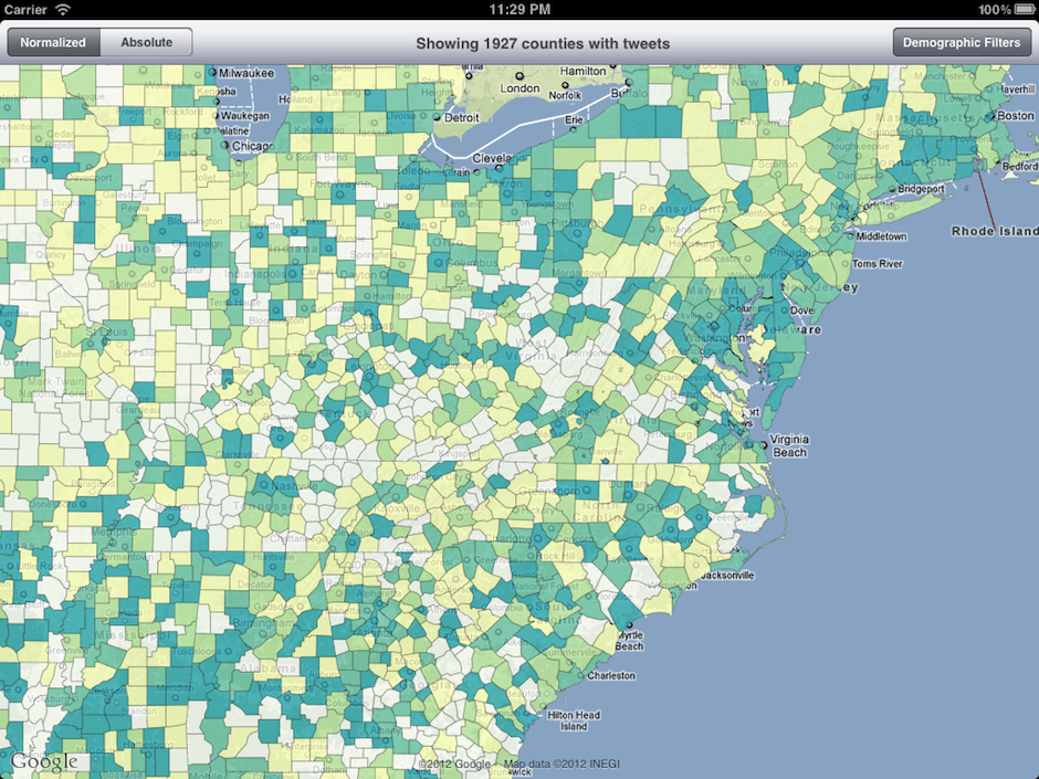
The final application uses a choropleth map with 7 color classes to color each of the counties in the continental United States with a representative color, given the normalized data value calculated as described above. Technically, this is implemented by parsing a U.S. county shapefile downloaded from the U.S. Census Bureau and converted by me to KML, which is then parsed, drawn, and colored by the iOS app at runtime. The user can choose to colorize the map by normalized or absolute tweet activity, the latter recoloring the map to show the densest tweet counties on an absolute scale.
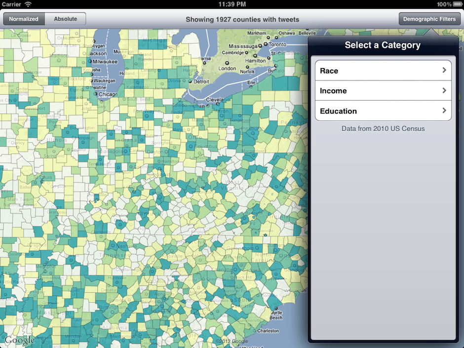
If the user wishes to apply a filter, they can do so by using the Demographic Filters button popover menu:
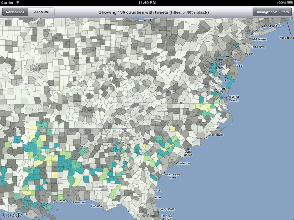
Once a filter is applied, counties which do not meet the filter are grayed out, and the counties which meet the filter criteria move to the forefront.
Limitations and Next Steps
This much data slows the iPad down pretty seriously. Despite using an extremely simple county polygon geometry file, there is a large wait time for the initial KML file to be parsed and drawn. Similarly, any interaction with the map that changes the zoom level forces another redraw. It would be useful if the user could tap on a county and find out some contextual information, but the iPad is a tricky platform to show this type of data. Learning on which overlay a user tapped is a non-trivial task in itself, and I didn't have time to implement it for this assignment.