Akord: Visual Email Analysis
For my Visualization and Insight on the iPad class in Spring 2012 at Carnegie Mellon University, students were tasked with creating an interactive visualization of any large dataset they chose. Everyone in the class submitted project ideas, received feedback from their peers, and most eventually joined one or two other students to develop an idea which had gained traction.
Along with my teammates, we developed Akord, a fresh visual look at both who you interact with through email most and in how much volume, all viewed through the lens of a period of time.
Team: Kaushal Agrawal and Kartikeya Dubey, fellow master's students in human-computer interaction at CMU
Duration: Three weeks
Skills used: sketching, Objective-C
Download: (The Xcode project is available upon request.)
Process
In the eight years I'd been using Gmail at the time of this project, my personal Gmail inbox had around 150,000 emails, and I was receiving about 125 each day. Most were mailing lists and other bulk mail that I auto-filtered to some extent, but invariably I seemed reluctant to unsubscribe from anything. I initially proposed creating an "Unsubscribe Assistant"—which would present some sort of data-driven analysis of your most commonly-received email domains.
After some feedback from the instructors and classmates and the addition of two teammates, we refocused the idea on more general email visualization. Rather than try to do the inference ourselves, we decided to let the data tell the story. Central among the questions we wanted to answer was "with whom do I interact most, and how often?" Alternately, we refocused the idea of unsubscribing to one that addressed the question "who am I ignoring?"
Concept sketching
We decided that clustering frequent contacts together along with the additional element of time was a compelling visualization, but we had no idea exactly how to visualize it. Among our constraints was the problem that gathering the information in a user's inbox takes a significant amount of time—one that didn't bode well for the momentary user experience users expect on an iPad. Another constraint was the sheer volume of email required some algorithmic or heuristic clustering. Due to the time constraints of the project, our instructors advised us to preload the data and pretend they could be generalized later (sound advice for an HCI project), and to use only a small subset of an inbox with a distinct focus. Concept sketches are shown below.
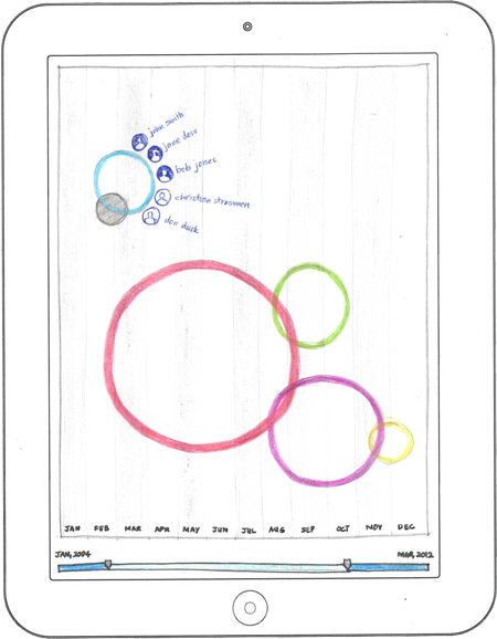
Here a user can view the busiest clusters by drilling into each and seeing individual contacts (in blue). The size of the bubble indicates the size of the cluster, while its y-axis position indicates the number of emails exchanged in that cluster.
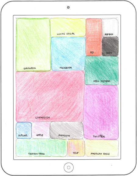
Here a user can view domains from which emails are sent but not replied, forwarded, or in any way interacted with by the user. The largest domains are tiled to the largest size, and a user could theoretically drill into an individual domain to look at individual email addresses.
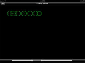
Final implementation
We named our application Akord, a term in several Slavic languages for chord which we felt described our circular clustering reasonably well; additionally, its similarity to the English word accord hinted at the idea of a user introspectively and harmoniously journeying through their email inboxes, a user experience goal of our design.
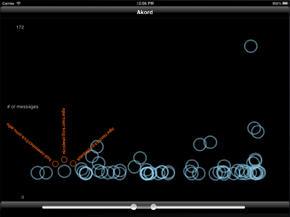
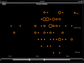
As with many HCI class projects, we hit several development obstacles that hampered our ability to fully implement the interaction and visual designs we'd imagined. Shown below are several screenshots from the final app. It strongly resembles the design sketched above on the left.
Due to the brief implementation period the project afforded us, we prototyped several visualizations and were not able to fully implement the visual or interaction design goals, but we believe the proof of concept could be easily expanded.