Personalized self-checkouts
For my class in User-Centered Research and Evaluation at Carnegie Mellon University, I explored researching and addressing issues users experienced when using self-checkout systems at a local grocery store.
My final deliverable, a report containing all of my work (excepting interview transcripts, which I have omitted for user privacy), is available here [pdf].
Duration: ten weeks
Skills used: literature review, competitive analysis, interviewing, contextual inquiry, storyboarding, paper prototyping, think aloud evaluations
Download: final report [pdf, 11 mb]
Research
New and innovative technologies can only succeed when customers begin to accept them as innovative. To explore this notion, I began my project with a literature review. From my readings, I learned that automated systems have extended to retail but have struggled to be accepted because users don’t currently see them as useful, easy to use, reliable, or fun.
Conducting a literature reviewing helped inform and narrow my user research, which consisted of three semi-structured interviews (one in context). My interviewees were all sharing their experiences with self-checkouts at a supermarket in the Pittsburgh area, and the interviews were all fairly brief (lasting from 10 to 30 minutes). Questions ranged from general grocery-buying habits to common problems encountered with self-checkout systems, and they were intended to bring out attitudes about the aforementioned four attributes without explicitly using those terms.
Research results
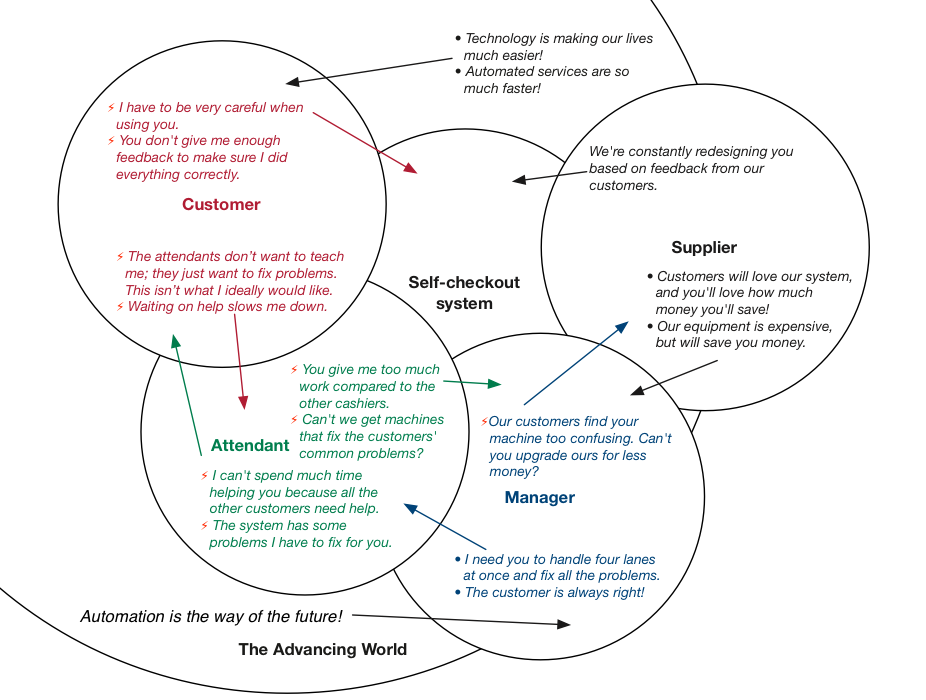
Much of my research provide evidence for problems that surfaced in the literature review. Below is a cultural model culled from my user interviews.

Additionally, I identified another attribute related to perceived ease of use but distinct: users lack confidence with using the systems. Following an affinity diagramming process, I identified four primary breakdowns:
- While self-checkout systems are ostensibly more convenient than traditional checkout lanes, they still involves tasks and requirements users consider unpleasant: bagging, ensuring proper weight, and using a small space.
- Waiting for attendants—who are often unfriendly—to help fix problems slows users down.
- Users feel uncertain about how the system works and lack confidence that they can use it problem-free.
- Even after the transaction, users are not certain they did everything correctly and got all the right prices.
Visioning
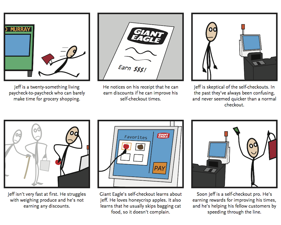
I brainstormed about twenty ideas and evaluated them using an impact vs. achievability matrix. Before building a prototype, I storyboarded the following scenario.

Following instructor feedback, I opted to only implement the context-aware favorites menu in my prototype, as the discount system seemed too exploitable.
Prototype and Evaluation
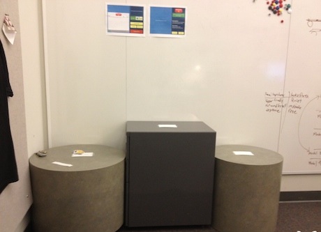
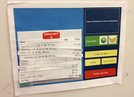
Given the short time frame of the class, I opted to implement a paper prototype with roughly physically accurate dimensions and a simplified workflow. To test this prototype, I conducted three think aloud sessions based on a hypothetical grocery trip. Users were told to follow the prototype screens and instructions as needed in order to complete checkout with eight items placed in their shopping basket. Each think aloud ran from eight to ten minutes, with all users participating in a short followup question and answer session.


Results and recommendations
The think aloud sessions validated the idea of customer favorites, with one user commenting that he “like[d] that featured a lot” and another using it almost immediately because the concept intrigued him. All three users had positive things to say about the new interface. Two noted that a final system must be sure to incorporate feedback that mirrors the printed receipt as closely as possible—it should show both the per-item savings and have a running total at the bottom of the screen as scanning is ongoing. A full list of suggestions and critical incidents that occurred during the three think aloud session is given in the full report.